
Lorenzo's
A design project to build a mobile app for Lorenzo's Italian restaurant.
Project Overview
The problem
Busy families, workers and commuters who lack the time and ingredients, equipment and know how, necessary to prepare a good Italian meal.
The goal
Design an app for Lorenzo’s that allows users to easily order and pick up fresh, healthy Italian dishes.
The product
Lorenzo’s is a restaurant situated In the West London area specialising in Italian food from all northern Italy. Lorenzo’s strives to deliver healthy northern Italian food, side dishes, beverages and alcohol. The pricing is competitive. Lorenzo’s targets families, commuters, workers, anyone who likes good authentic Italian food who doesn’t have the time and ability to prepare and cook Italian food for themselves
My role
UX designer designing an app for Lorenzo’s restaurant from conception to delivery.
Responsibilities
Conducting interviews, paper and digital wireframing, low and high-fidelity prototyping, conducting usability studies, accounting for accessibility, and iterating on designs
Project duration
February 2022 to January 2023
Understanding the user
We conducted interviews and created empathy maps to understand the users we are designing for and their needs. Primary user groups identified through research was working adults, families, local business and students who don’t have time ingredients and equipment to cook authentic Italian dishes. We are creating the Lorenzo’s app to help customers make single or multiple Lorenzo’s orders for pick up at once. We need to find out if the main user experience of ordering through the app is easy for users to complete.
User pain points
1. Homepage
Food website designs are often busy, specials, favourites, multiple options which can result in confusing navigation.
2. Checkout
On food websites there are often a lot of problems at checkout, amending orders, pricing and others.
3. Edit order
Online food websites don’t always provide an engaging browsing experience. If the food doesn’t look good your not buying !
Problem statement:
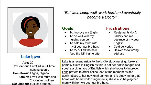
Leke is a full time student at nursing college who needs easy access to fast food options through an app
because she has not much time for cooking and also when verbally ordering there are language problems.
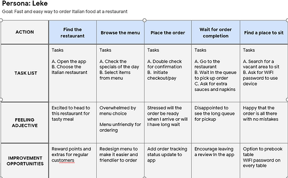
User journey map
Mapping Leke’s user journey revealed how helpful it would be for users to have access to a dedicated Lorenzo's app.
Starting the design
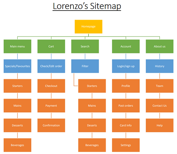
Sitemap
Difficulty with website navigation was a primary pain point for users, so I used that knowledge to create a sitemap.
My goal here was to make strategic information architecture decisions that would improve overall website navigation. The structure I chose was designed to make things simple and easy.
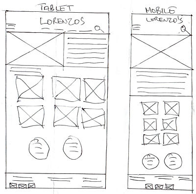
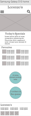
Paper wireframes
Wireframes
Next, I sketched out paper wireframes for each screen in my app, keeping the user pain points about navigation, browsing, and checkout flow in mind.

Screen size variations
Because Lorenzo's customers access the site on a variety of different devices, I started to work on designs for additional screen sizes to make sure the site would be fully responsive.
Digital wireframes
Moving from paper to digital wireframes made it easy to understand how the redesign could help address user pain points and improve the user experience.
Prioritizing useful button locations and visual element placement on the home page was a key part of my strategy. As well as screen size variation for responsive web.
Desktop

Tablet

Mobile
Usability Study Findings
To start testing the designs, I created a low-fidelity prototype which you can view from the above button. This prototype was used in an unmoderated usability study with 5 participants. Here are the main findings uncovered by the usability study:
1. Homepage
Poor navigation from homepage to order completion, was making it difficult for users to complete an order.
2. Checkout
Once at the checkout screen, users didn’t have a way to edit the quantity of items in the cart.
3. Site Menu
Poor visibility and navigation on site and
NO site menu.
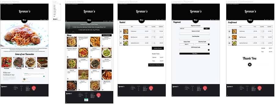
Refining the design
Mockups
After a lot of feedback from users it was decided to redesign the website, as one user put it,
“It looks like a site for a kebab shop…not a high end Italian restaurant”
So it was redesign time. This gave me the opportunity to fix a lot of problems/insights like the colour scheme, now I have made it high contrast black & white to help the visually impaired and was able to fix homepage navigation problems. Before items like specials and favourites used to go to their own item page and users would get lost and end up starting again. Now all food ordering goes to the menu page. On the new homepage I have created a big Menu CTA button (highlighted) hopefully to drive users there
Before usability study
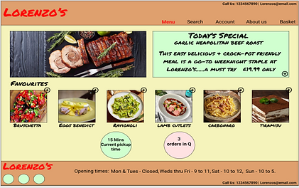
After usability study
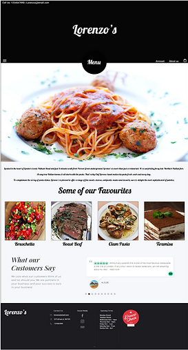
Users had issues with the checkout/basket page, first of all they said it should be called basket or cart not checkout, 2nd you should be able to add or take away from your basket and lastly you should be able to update your basket to reflect your changes. As you can see there was none of this In the original design. It is In the new design see highlighted far right. I use up and down arrows for quantity then update to confirm changes. And it is now called basket not checkout.
Before usability study

After usability study
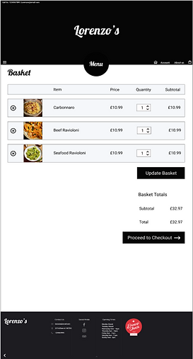
Accessibility considerations
1. Homepage
We completely redesigned the homepage so that the CTA buttons and colour scheme were more prominent to assist the visually impaired.
2. Site Menu
We created a hi contrast overflow menu in black and white for easier navigation and to assist the visually impaired to navigate more easily.
3. Help
In our first usability study one of our participants was an elderly lady who emphasized to us the importance of good “Help” for users of her age. We created a new help area on the about us page to assist the elderly and other users (ongoing).
Mockups contd.
Screen size variations
I included considerations for additional screen sizes in my mockups based on my earlier wireframes. Because users shop from a variety of devices, I felt it was important to optimize the browsing experience for a range of device sizes, such as mobile and tablet so users have the smoothest experience possible.
Desktop
Tablet
Mobile


Going forward
Takeaways
Impact
Our target users shared that the design was intuitive to navigate through, more engaging with the images, and demonstrated a clear visual hierarchy.
What I learned
I learned that even a small design change can have a huge impact on the user experience. The most important takeaway for me is to always focus on the real needs of the user when coming up with design ideas and solutions.
Next steps
1. Testing
Conduct follow-up usability testing on the new website.
2. User research
Identify any additional areas of need and ideate on new features.