Food60+
A design project to build a website/app for Food60+ sponsored by St Pauls Church.
Project Overview
The problem
Elderly people (60+) who find it difficult to get out and sometimes lack the time, finances, ingredients, equipment and know how, necessary to prepare a good healthy evening meal.
The goal
Design a responsive website & app for Food60+ that allows users to easily reserve seats at Food60+ canteen, that works across all devices and that provides booking numbers in advance.
The product
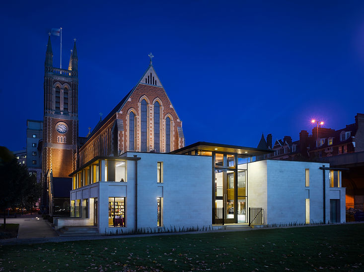
Food60+ is a west London charity organisation run by St Pauls Church focused on providing a free healthy and nutritious sit down evening meals to the over 60 age group. Food60+ also works with all the major supermarkets In the area who donate all the food with the combined goal of cutting food waste. The church wants an app which will give the users a way to book seats In advance and also so they can get the daily booking numbers so they don’t over cook leading to food waste.
My role
UX designer designing a website & app for Food60+ from conception to delivery.
Responsibilities
Conducting interviews, paper and digital wireframing, low and high-fidelity prototyping, conducting usability studies, accounting for accessibility, and iterating on designs
Project duration
Jan 2022 to March 2023
Understanding the user
We conducted interviews and created empathy maps to understand the users we are
designing for and their needs. Primary user groups identified were the 60 years and over users who reside within the borough who don’t have time ingredients and equipment to cook healthy evening meals, there was also a secondary user group who were the local business’s who donated the food who look In from time to time to see how their donations are going and try out the menu. We are creating the Food60+ website & app to help the over 60’s book seat reservations from the comfort of their home and also to get numbers In advance to prevent food waste.
User pain points
1. Shopping
Getting to shops to buy groceries.
2. Cost
Cost of good food i.e. organic.
3. Solitude
If you live on your own, sometimes you do't commuicate with people for days.
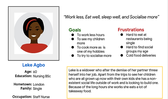
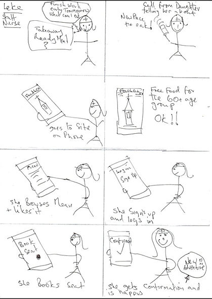
Persona's & Problem statements: Leke
Leke is a is a full time staff nurse at Chelsea hospital who needs access to good food options through an app because she doesn't have much time for cooking as she works long hours and has a long journey home after work.
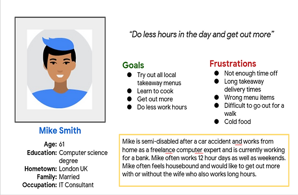
Persona's & Problem statements: Mike
Mike is a IT consultant who works from home who needs to get out to eat more often because Mike is partially disabled and gets claustrophobic spending so much time at home.
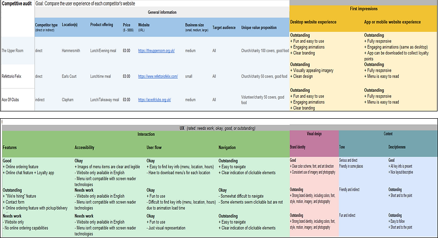
Competitive Audit
An audit of a few competitor’s website’s provided direction on gaps and opportunities to address with the Food60+ app.
Ideation
I did a quick ideation exercise using crazy 8’s on Leke’s problem statement & user journey to come up with ideas for how to address gaps identified in the competitive audit. My focus was specifically on finding and booking a seat on the Food60+ responsive website.
Starting the design
Digital wireframes
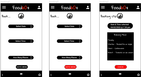
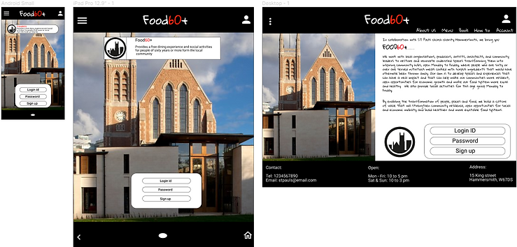
Users have to register & login before you can make seat reservations so we kept it minimalist to steer users to signup. However as there was no page links users said it looked like fraud site, so we added an about page, users complained there was no menu or help, so we added them also. Click button below to view lo-fi prototype.
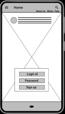
We had to add these pages after 1st usability study
Users have to register & login before you can reserve seats
Affinity Diagram
An Affinity diagram was key for gatthering and organizing data, for identifying patterns and themes to come up with insights after the 1st usability study for the Food60+ app/website.
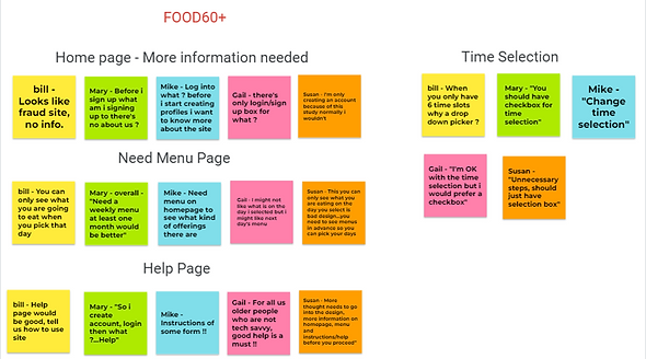
Usability Study Findings
To prepare for testing, I created a low-fidelity prototype which you can view by clicking button below. I used this prototype to conduct an unmoderated usability study with 5 participants. Here are the main findings uncovered by the usability study:
1. Homepage
No about us or any page links on homepage. Users think its fraud site and will not register.
2. Menu
Users complained no menu page “what am I booking for”
3. Help
No instructions on how to use site and how to book. Elderly users need Help.
Refining the design
Mockups
Before usability study
After 1st usability study
After 2nd usability study
We went from no navigation or help/info pages because we were steering users to sign up. We then added 3 pages (middle image), users still not happy as links small and hard to read so we created a high contrast overlay menu (far right) which you access from the hamburger icon….users happy !!
Before usability study's
After usability study's
Additional design changes included changing the colour of the CTA buttons providing a clearer indication to the elderly what buttons to press. See highlighted.
Accessibility considerations
1. Homepage
Created high contrast overflow menu for clearer navigation to help visually impaired.
2. Site Menu
Made all the CTA buttons
Bright red to help the visually impaired.
3. Help
Added much better Help with clear instructions on how to use the site/app, requested by the elderly.


Responsive Design
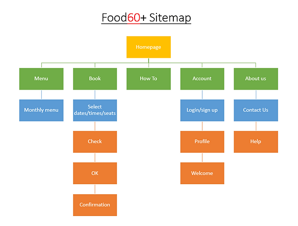
Sitemap
With the app designs completed, I started work on designing the responsive website. I used the Food sitemap to guide the organisational structure of each screen’s design to ensure a cohesive and consistent experience across devices.
Mobile
Desktop
Tablet
Responsive Designs
The designs for screen size variation included mobile, tablet, and desktop. I optimized the designs to fit specific user needs of each device and screen size.
Mobile
Tablet
Desktop
Going forward
Takeaways
Impact
The app makes users feel like Food60+ really thinks about how to meet their needs.
One quote from peer feedback:
“The app made it so easy and fun to reserve seats! I would definitely use this app as a go-to for bookings at Food60+.”
What I learned
I learned that even a small design change can have a huge impact on the user experience. The most important takeaway for me is to always focus on the real needs of the user when coming up with design ideas and solutions.
Next steps
1. Testing
Conduct research on how successful the app is for making bookings and reaching the goal to reduce food waste.
2. User research
Conduct follow-up usability testing on the new app/website and Identify any additional areas of need and ideate on new features.