A design project to build a mobile app for BBQ Shack restaurant.
BBQ Shack
Project Overview
The problem
Busy workers and commuters lack the time necessary to prepare good BBQ meal.
The goal
Design an app for BBQ Shack that allows users to easily order and pick up fresh, healthy dishes.
The product
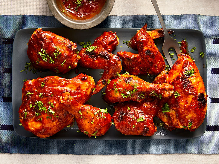
BBQ Shack is BBQ restaurant located in West London/UK. BBQ Shack strives to deliver healthy, speciality BBQ and side dishes. They offer a wide spectrum of competitive pricing. BBQ Shack targets families, customers like commuters and workers who lack the time or ability to prepare a good BBQ dinner.
My role
UX designer designing an app for BBQ Shack from conception to delivery.
Responsibilities
Conducting interviews, paper and digital wireframing, low and high-fidelity prototyping, conducting usability studies, accounting for accessibility, and iterating on designs
Project duration
October 2020 to February 2021.
Understanding the user
We conducted interviews and created empathy maps to understand the users we are designing for and their needs. Primary user groups identified through research was working adults, families, local business and students who don’t have time ingredients and equipment to cook barbecue dishes. We are creating BBQ Shack app to help customers make single or multiple BBQ Shack orders for pick up at once. We need to find out if the main user experience of ordering through the app is easy for users to complete.
User pain points
1. Homepage
Poor navigation
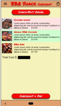
2. Checkout
Cannot amend order at checkout
3. Edit order
No idea or help on how to edit an order
Problem statement:
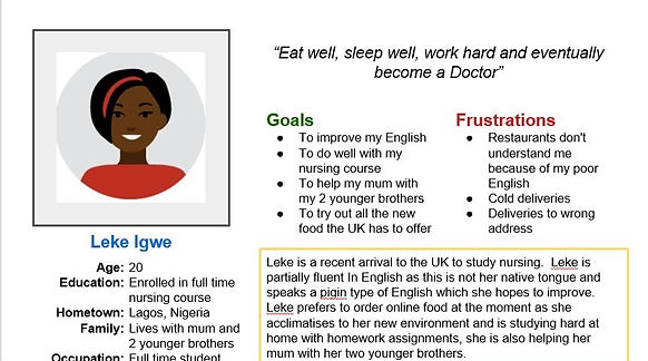
Leke is a full time student at nursing college who needs easy access to fast food options through an app
because she has not much time for cooking and also when verbally ordering there are language problems.
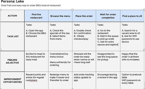
User journey map
Mapping Leke’s user journey revealed how helpful it would be for users to have access to a dedicated BBQ Shack app.
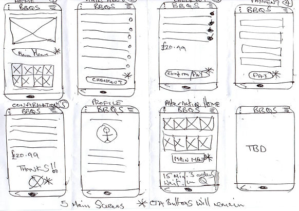
Starting the design
Paper wireframes
Taking the time to draft iterations of each screen of the app on paper ensured that the elements that made it to digital wireframes would be well-suited to address user pain points. For the home screen, I prioritized a quick and easy ordering process to help users save time.
I marked the main user flow 1 through to 5. I drew an alternate homepage and a profile page.
Digital Wireframes
As the initial design phase continued, I made sure to base screen designs on feedback and findings from the user research.
Easy navigation was a key user need to address in the designs in addition to equipping the app to work with assistive technologies.
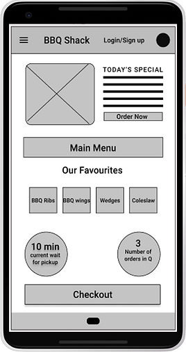
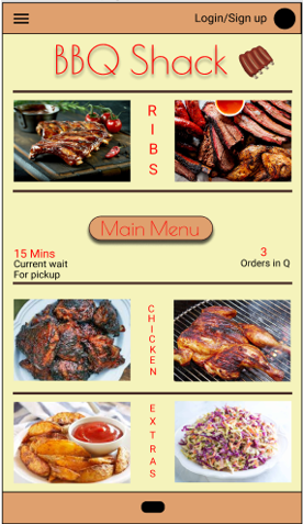
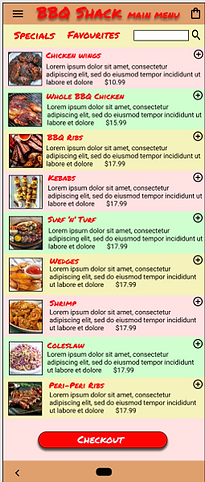
Can order food items like the special of the day directly from home page

Easy access to navigation menu that’s screen reader friendly.
Usability Study Findings
I conducted two rounds of usability studies. Findings from the first study helped guide the designs from wireframes to mockups. The second study used a high-fidelity prototype and revealed what aspects of the mockups needed refining.
Round 1 findings
1. Poor homepage design
2. Problems at checkout
3. Cannot edit order
Round 2 findings
1. Poor visibility on CTA buttons
2. Poor visibility and navigation on site menu
3. Help menu needs to be better
Refining the design
Mockups
Before first usability study
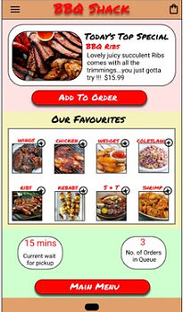
In the before image (left), users stated that the CTA button for main menu was not prominent enough and blended in with the app design colours, and could easily be missed, especially for the visually impaired. We redesigned the homepage with larger CTA buttons and more standout and prominent colours (far right).
After first usability study
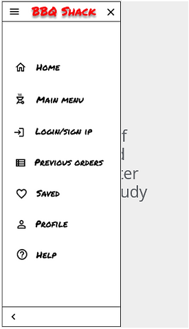
In the before study, users stated that the navigation to get to different areas of the site was not well defined (left). We designed a navigation overflow menu with all the key navigations (far right) which has good contrast and is accessible from any page via site hamburger menu icon (top left)


After first usability study
After second usability study
Accessibility considerations
1. Homepage
We completely redesigned the homepage so that the CTA buttons and colour scheme were more prominent to assist the visually impaired.
2. Navigation
We created a hi contrast overflow menu in black and white for easier navigation and to assist the visually impaired to navigate more easily.
3. Help
We created a new help page to assist the elderly and other users.

Going forward
Takeaways
Impact
The app makes users feel like BBQ Shack really thinks about how to meet their needs.
One quote from peer feedback:
“The app made it so easy and fun to order BBQ !! I would definitely use this app as a go-to for a delicious, fast, and healthy BBQ meal.”
What I learned
While designing the BBQ Shack app, I learned that the first ideas for the app are only the beginning of the process. Usability studies and peer feedback influenced each iteration of the app’s designs.
Next steps
1. Testing
Conduct another round of usability studies to validate whether the pain points users experienced have been effectively addressed.
2. User research
Conduct more user research to determine any new areas of need.